Oxford’s own Annie Sloan – fine artist, paint-maker, colour expert, entrepreneur, and author – has opened her archives for OX Homes. For this issue, Annie tells us how she used her Chalk Paint™ to create this wonderfully bright, fresh living space.
“This indoors-outdoors space is inspired by my travels in Havana, Cuba. It’s on my website, and I thought it would be a great choice to share with you for the Spring issue of OX Homes.”
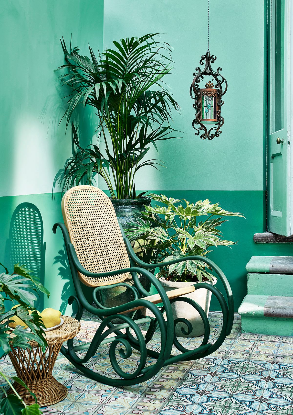
When we think of Havana style, we think breezy high-ceilinged rooms filled with colour. I’ve used my Chalk Paint™ for this project, as I really wanted to emphasise the texture. The stripe halfway up this wall exaggerates the width of this space and draws the eye to create the illusion of wider walls and a larger room. It’s a brilliant design hack in a small apartment or garden adjacent room such as this Havana inspired conservatory. The calming colour palette of greens is classy but cool – if there’s one thing Cubans know, it’s colour.
If you want to channel this splendidly lush look, be sure to choose blue-toned greens rather than yellow-toned greens to create a cool, calm feeling of oasis. Leaving natural textures on display, as with these rattan furnishings, and dressing with plants anchors the space and reinforces the feeling of an “organic ” atmosphere.
Everything else in the room (flooring, furniture, and shelving) is painted in symphonic shades of blue greens (namely Florence, Provence, and Amsterdam Green) and this serves two purposes. Firstly, the blue-toned elements of these colours are recessive and make the space feel larger, grander, and therefore calmer and more tranquil. Secondly, the green makes a statement (as a single-coloured tonal space always will) with specific reference to lush foliage and the quiet of a dense rainforest. You can heighten these references by including bushy house plants in your home: think statement leaves and go for big plants over small. Fitting the biggest, tallest plant possible in the room will emphasise the dimensions of the space and add to that feeling of grandeur which we think of when we think of Havana. More foliage means more botanical bang for your buck.
When you’re working with just one colour be sure to include shades with different personalities and characteristics. Here, the depth of Chalk Paint™ in Amsterdam Green provides gravitas and structure; Florence brings some excitement, and Provence emphasises the blue-leaning nature of these shades. This calming oasis will be a perfect place to spend time whatever time of day; with coffee to start your day, or perhaps a rum punch and some music in the evening.
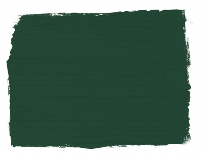
Amsterdam Green
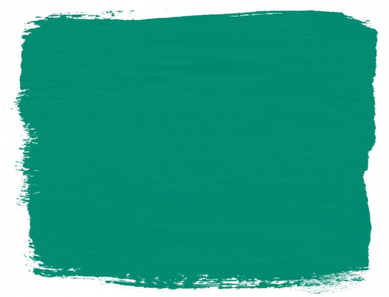
Florence
My Chalk Paint™ is water-based paint and it is designed to be easy. You can brush it over any surface and when you finish with a layer of my Chalk Paint Wax it will harden the paint and protect it against knocks and bumps.
If you’re loving the green but after a more straightforward design, let me recommend my Schinkel Green Wall Paint for a different, but equally verdant feel. I love pairing it with similarly vivid shades, like this Capri Pink Butlers’ tray, sitting atop a sideboard transformed with my Napoleonic Blue Chalk Paint™.
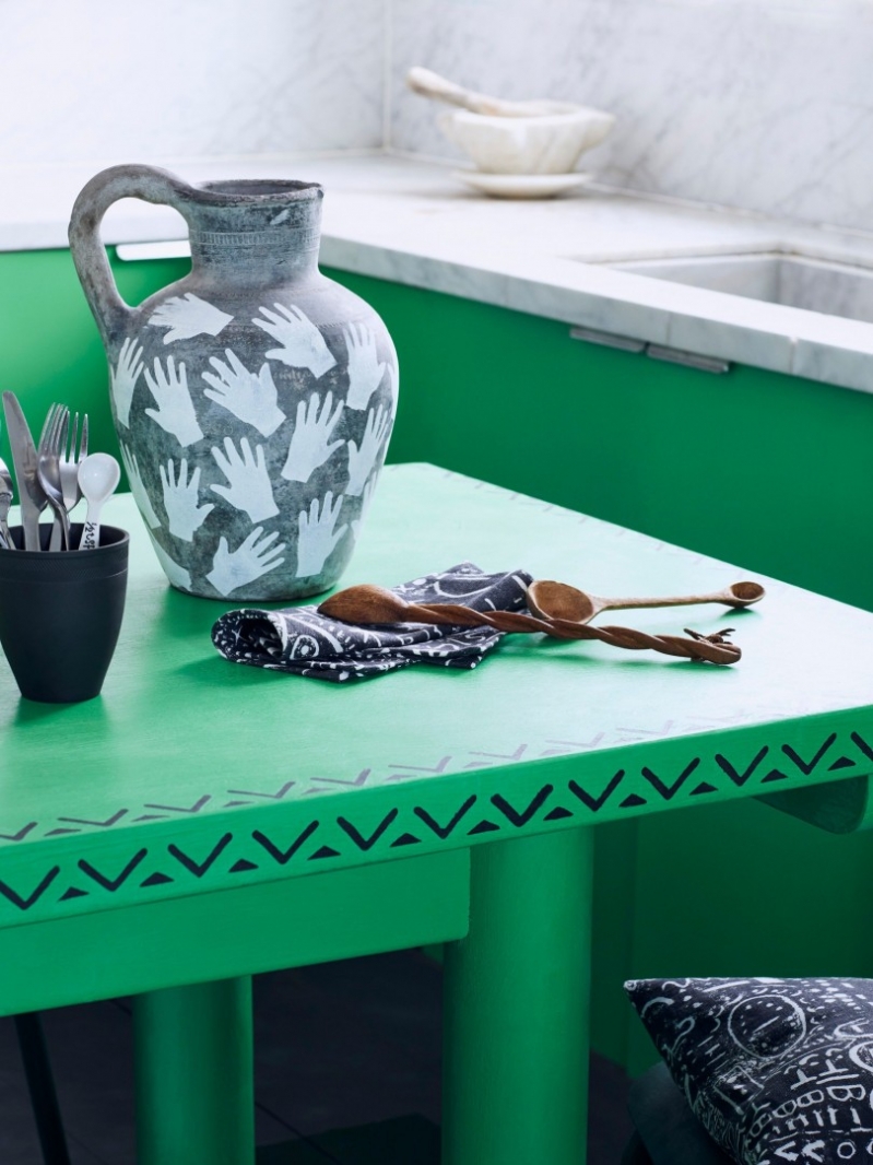
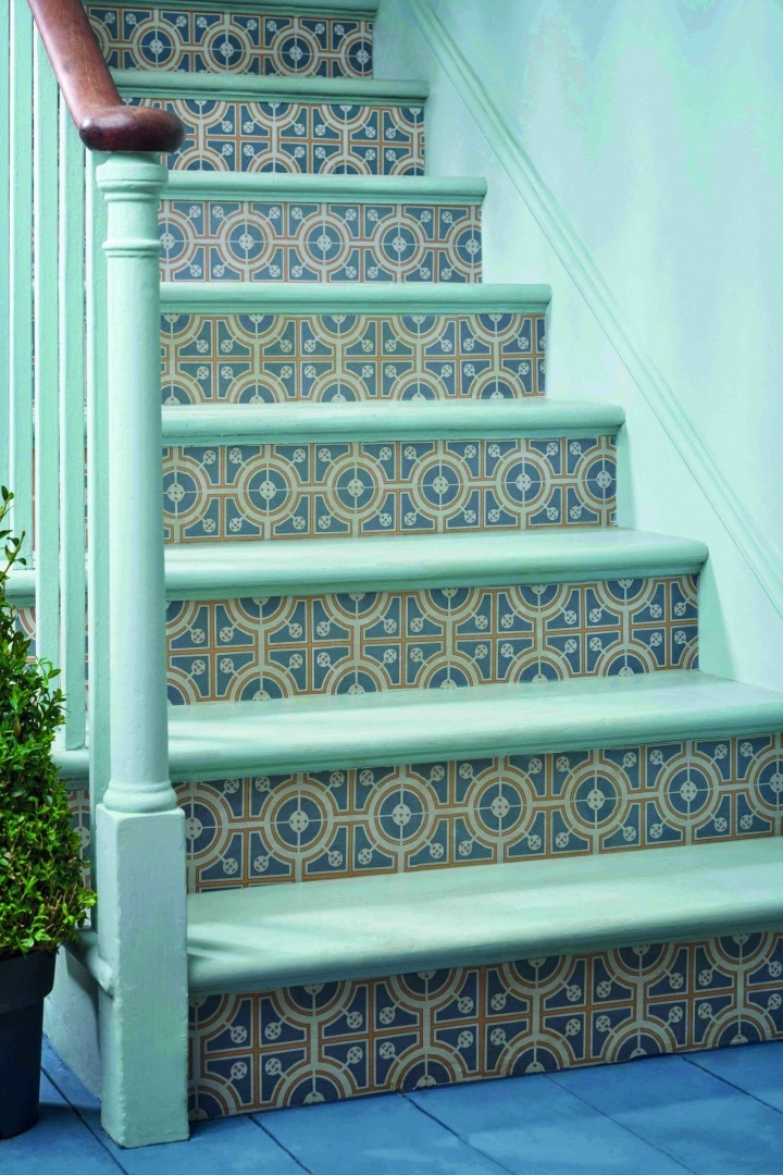
Finally, another option to introduce some greenery into your living space is to create a statement piece, like this kitchen table in Antibes Green – I’ve actually also used Chalk Paint™ to add some vibrancy to this kitchen and I love how it looks against the cool marble worksurface. I’ve edged it with a repeat design which I think gives it that Latino vibe. Or, how about decoupage? These stairs use my RHS Decoupage design, Roundabouts, which give a tiled effect. Really, there are no limits to how and where you can use colour in your home!
Can I just mention here that I’ve noticed a recent interiors trend towards using painted stickers to replace paint samples. Although it’s marketed as simple and straight forward, there’s a few reasons I have chosen to stick with providing Wall Paint tester size tins over stickers. First, they’re recyclable and reusable. I also think it’s important for you to assess how the paint feels as you brush it – it tells you so much about the quality of the product. My paint gives maximum pigment pay-off and is easy and smooth to apply, so you really get a feel for the quality and see how it comes across in different lights. Finally, a sticker is produced on a perfectly primped, primed surface – it is sprayed with precision, rather than applied by a human which means it’s not a realistic representation of the finish.
