Oxford’s own Annie Sloan – fine artist, paint-maker, colour expert, entrepreneur, and author – has opened her archives for OX Homes. For this issue, Annie tells us more about her lifetime love of greens.
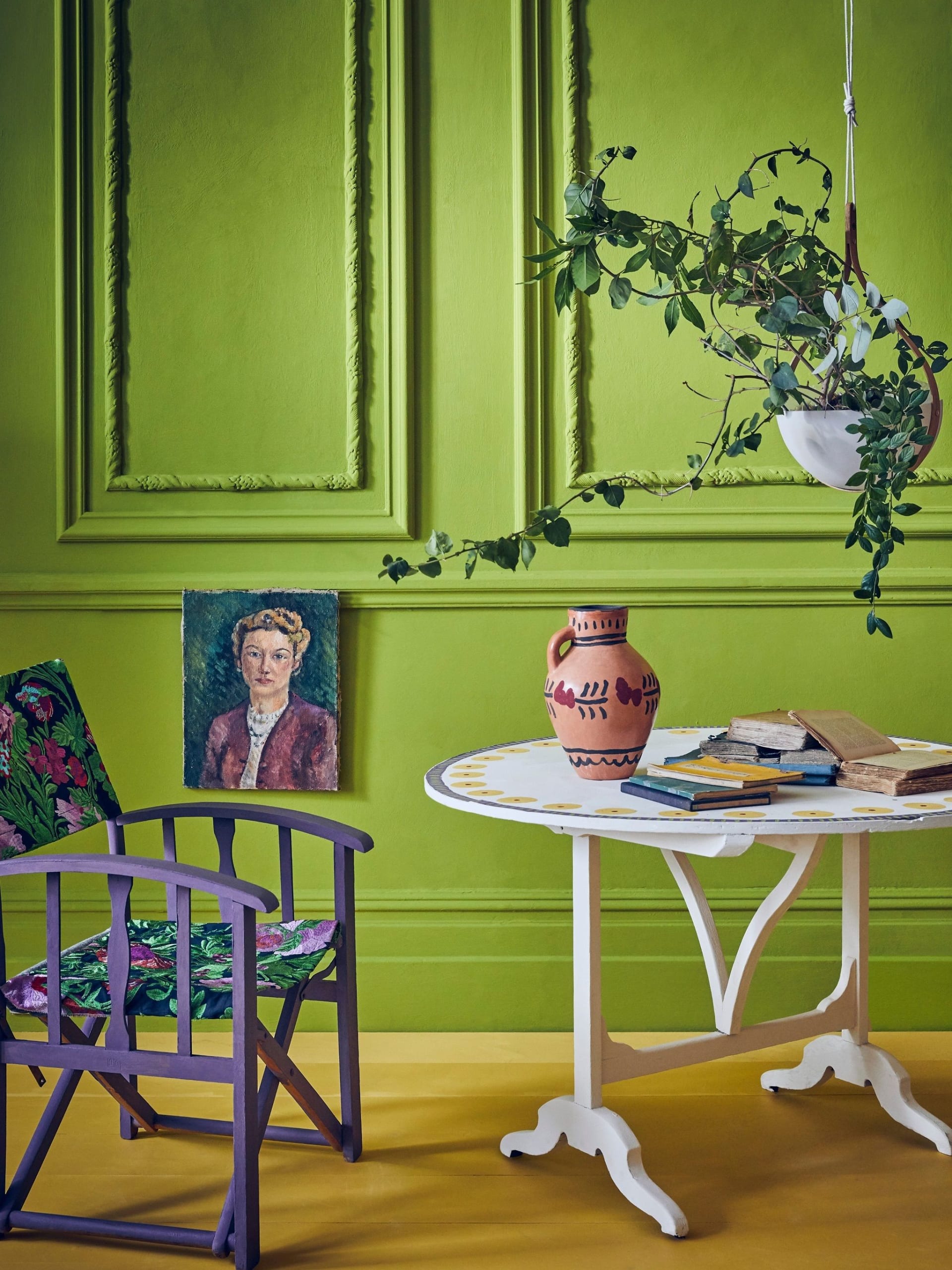
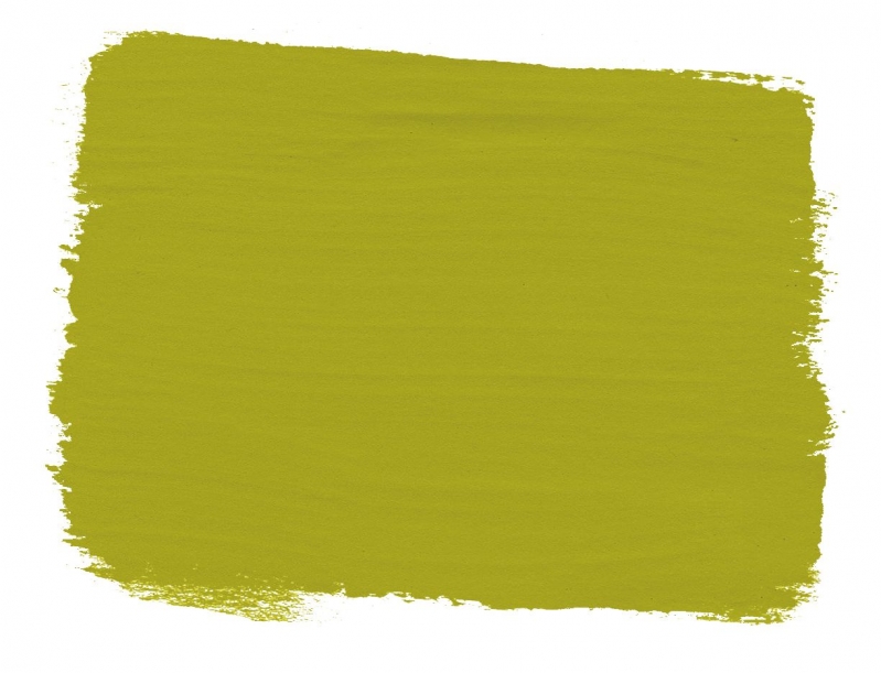
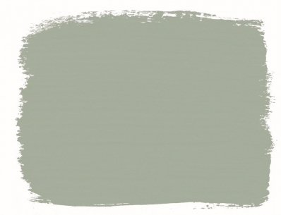
What better colour for Spring than green? It’s one of my favourites and I’ve recently launched two new greens to my collection: Charleston Firle, an uninhibited citrus shade, inspired by the Bloomsbury Set and part of the Charleston Farmhouse range of Chalk PaintsTM; and Coolabah Green, named after the Coolabah eucalyptus tree, made famous in the lyrics to Waltzing Matilda, Australia’s unofficial anthem. Did you know I spent the first 10 years of my life in North Sydney?
Which paint colours go best with green?
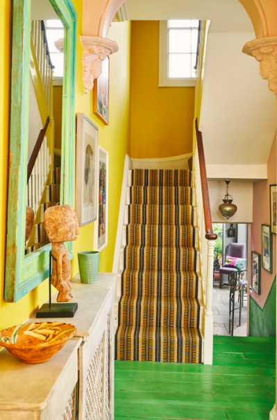
Greens are a broad spectrum! Try to look at the tone and character of the green you’re using and ascertain whether it’s more blue green (Coolabah) or more yellow-green (Firle) when choosing colours to pair it with. Pinks and greens make for elegant, interesting, and beautiful spaces. Whether you’re pairing a dark green with a pastel pink, a sage green with an earthy terracotta pink, or a hot pink with a bright green, they all work.
Why choose green for a living room?
I think at the moment we are reaching for comfort, security, and the beauty of nature for reassurance. A soft green is the perfect colour for this, something like Château Grey or Olive gives depth and softness in equal measure and can be dressed with virtually any other colour – from traditional Tuscan earth tones, to strong modern pastels, or romantic farmhouse neutrals.
How about green in the bedroom?
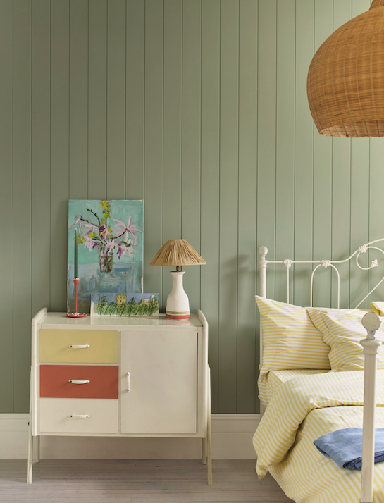
I prefer darker greens in bedrooms as they give a sublime, cosy, nest-like feeling all year round. Whilst a lighter green will look fabulous in daylight, consider how this colour may look when lit by artificial lamplight as you’re reading in bed.
Go dark!
Don’t be afraid to use darker shades of green in your home. Dark green paint colours are best used in a space with good natural lighting or somewhere you’re hoping to create a sense of cosiness and safety. I find it a reassuring colour; it makes one think of libraries, of ancient woodlands, and of stability. It’s a brilliant alternative to navy blue and in these times of turmoil when we’re at home more than ever, it will provide a therapeutic feeling in a space.
The most soothing shade?
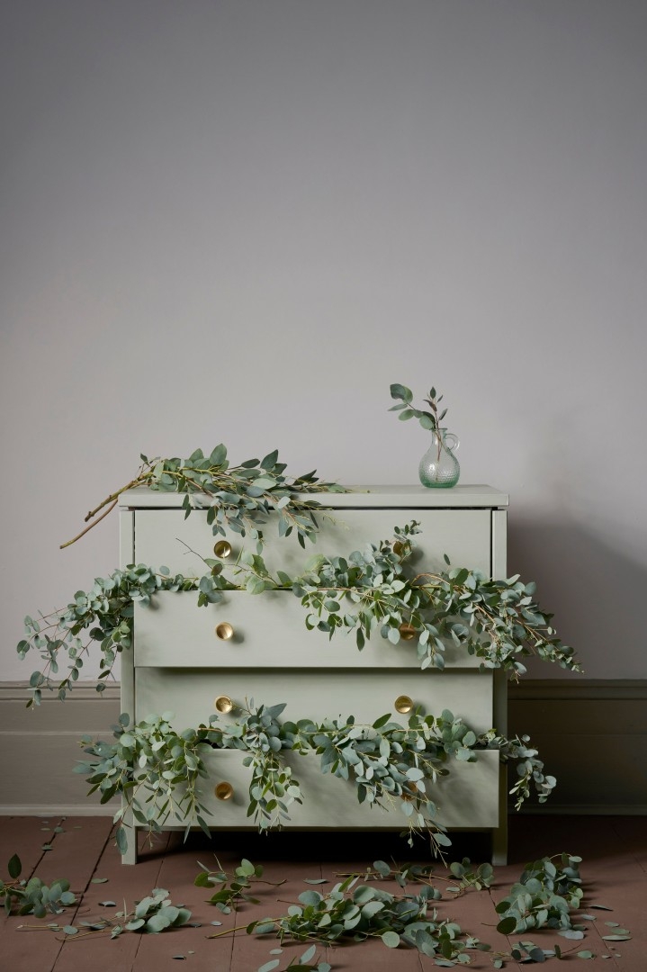
I love grey green paints because they’re soothing without being dull. A wonderful alternative to whites: this is colour for beginners. A soft grey green is endlessly rewarding. Easy to work with, yet complex, soft and beautiful but not saccharine – just like me! Ha. Just make sure you’ve tested the colour where you’re going to use it; colours this subtle will look very different depending on the light in a room. If you choose the wrong grey green for your space, it’ll lean too grey, too green, or too flat. This is something to watch out for especially with colour matched paints. You need real depth of pigment and high-quality paint ingredients when you’re working with a delicately balanced colour.
Grey greens promote contemplation and relaxation. They’re evocative of nature, of herb gardens and natural stone. They are soothing colour choices. Pair with soft pinks or blacks and whites to maximise these attributes.
Green on the Outside
If you’re using green outside make sure you choose an exterior paint or protective finish with UV defensive qualities. Greens can fade more easily than other colours, so the UV protector in my Chalk Paint™ Lacquer will keep them bright and beautiful for longer.
Use a bright green for a modern, jungle look – this is particularly effective in a smaller garden or one where there is lots of paving. It’ll give the idea of abundance and verdancy. I love using green paint everywhere; I painted my garden gates using Chalk Paint™ in Olive because it’s a very rustic, French colour which matches the lichen splotches and old brick around my garden beautifully. It makes me feel as though I’m in Tuscany every time I nip out.

