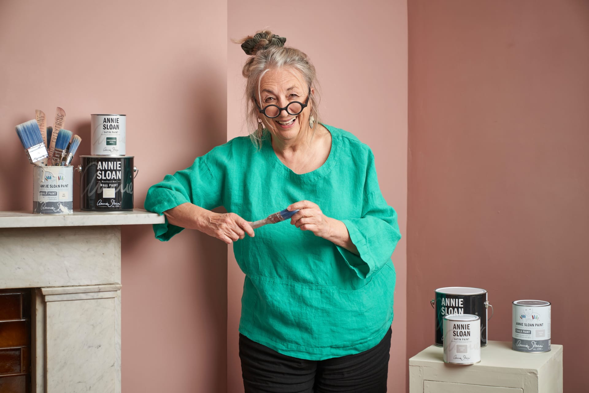
Oxford’s own Annie Sloan CBE – fine artist, paint-maker, colour expert, entrepreneur, and author – has opened her archives for OX Homes. For this issue, Annie’s looking ahead with her 2024 Colour Predictions.
This year I predict a movement towards colours which empower and allow for full self-expression, using paints which are sustainable and kind to the planet.
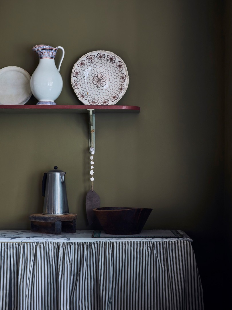
Wall Paint in Olive Chalk Paint in Chateau Grey and Primer Red Ticking in Olive curtain
Let’s start with Olive. The red pigment keeps it warm and serene and its natural-toned green speaks to nature. It is a particularly tranquil shade, which will change with the light in your room – paler than forest green, deeper and more dramatic than sage. It’s a dynamic shade and will resonate in any room.
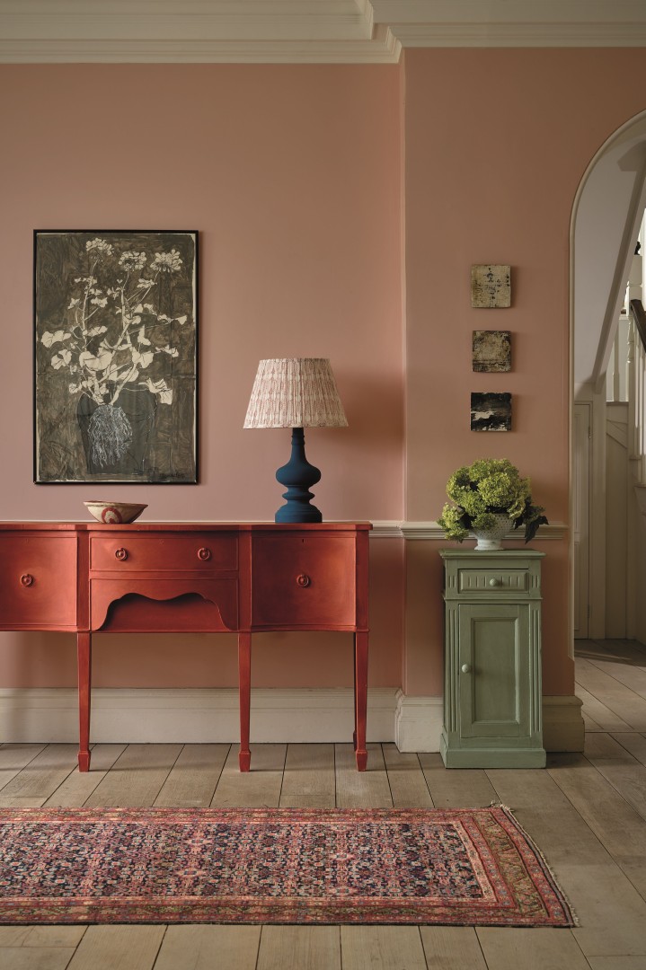
Chalk Paint in Paprika Red
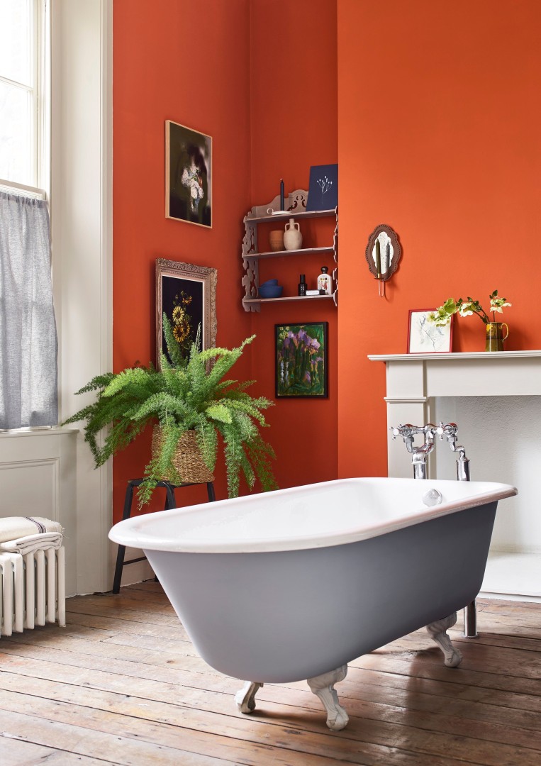
Bathroom Satin Paint In Canvas Riad Terracotta
Next, I turn to terracotta, particularly my Paprika Red Chalk Paint or Riad Terracotta Wall Paint. I love to see it used in kitchens and dining spaces, sparking creativity and encouraging a warm conviviality. I know it may seem synonymous with the early 00s, but I love it still. It creates intimacy and it also references the Hamman spas of Morocco, so can be particularly striking in a bathroom. In fact, I’ve recently used Riad Terracotta in my own bathroom and am delighted by its contrast with the very traditional fixtures and fittings in my Victorian house. I find it very elegant.
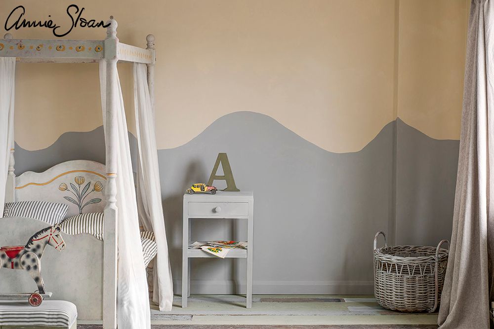
Old Ochre and Paris Grey Wall Paint
If you want a timeless choice, look no further than Old Ochre. It is beige but it has surprising richness and a velvety finish which whispers indulgence – very much in keeping with the trend towards quiet luxury. I love colour, so perhaps this is an unusual choice, but it is all about how you use it – and which other colours you pair it with. Contrast it with Athenian Black for drama or a blue green like Aubusson Blue to bring out its warmth. It is understated and contemporary.
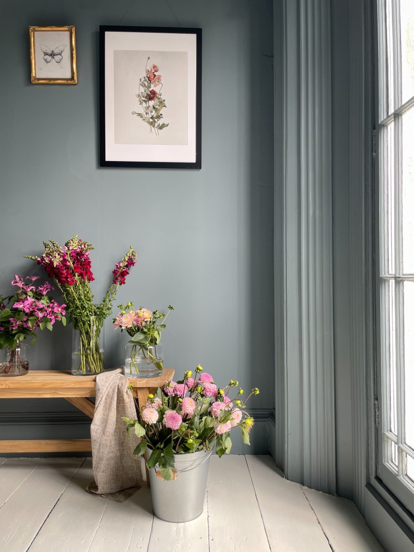
wildinthewolds after colour drenching with Cambrian Blue
Equally sophisticated, Cambrian Blue has a steely strength which makes it a wonderful choice for working areas like a home office. Like dark denim blue, this beautiful cool shade will go with everything. It also makes a self-assured statement in hallways or even on your front door. The grey pigments in the paint reflect the light making it one of my more changeable shades. At time grey like cloudy sky before morphing into a quietly confident restful blue.
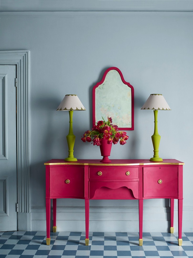
Capri Pink Sideboard Mirror And Vase
For contrast, how about a pop of Capri Pink? It really helps to add personality to an otherwise neutral space. Try it out on some upcycled furniture to feel the joy of its vivid tone or for full effect, cover your walls in a hybrid Hollywood Regency-inspired statement.
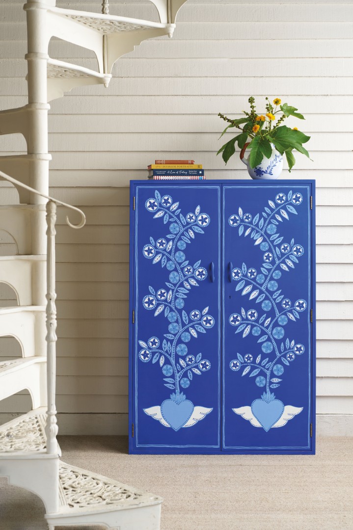
Frida Blue Mexican Design Inspired Cupboard by Dingley Dell
Finally, I’m thrilled to introduce my newest shade; Frida Blue. Named for Frida Kahlo who painted her home in Mexico City in this beguiling, energising colour. I’ve been using it on furniture and am thrilled by the jolt of colour it injects into its surrounding space. Do try it, I promise you’ll love it.
Pairing Notes
1. Try Olive green with natural wood to bring out its organic feel. Add an unexpected regal note with touches of gold.
2. For a grounded look, rich terracotta should be balanced with neutral grey or grey-toned green.
3. Old Ochre can be used to make a bouji style statement with the right accessories; shaggy rugs, textured boucle fabrics and pared back décor. Alternatively, play up its inherent elegance with muted pastels.
4. Cambrian Blue works well against soft pinks with metallic accents for that popular Scandi-inspired airy chic.
5. Be bold and confident with Capri Pink and Frida Blue – try either with clashing contrasts like hot red, zingy turquoise or more restrained but equally striking navy blue.
6. Above all, don’t be afraid of colour. Use it to discover your own personal style and celebrate it. Make your living spaces empowering and dynamic.

