Claire Berliner Benson describes herself as ‘a colour addict’. Based in Oxford she has spent 25 years working as an artist and graphic designer. After coming across her work during Artweeks last May we were eager to learn more about her ‘colour conversations’ and what inspires her to paint.
Tell us about your art.
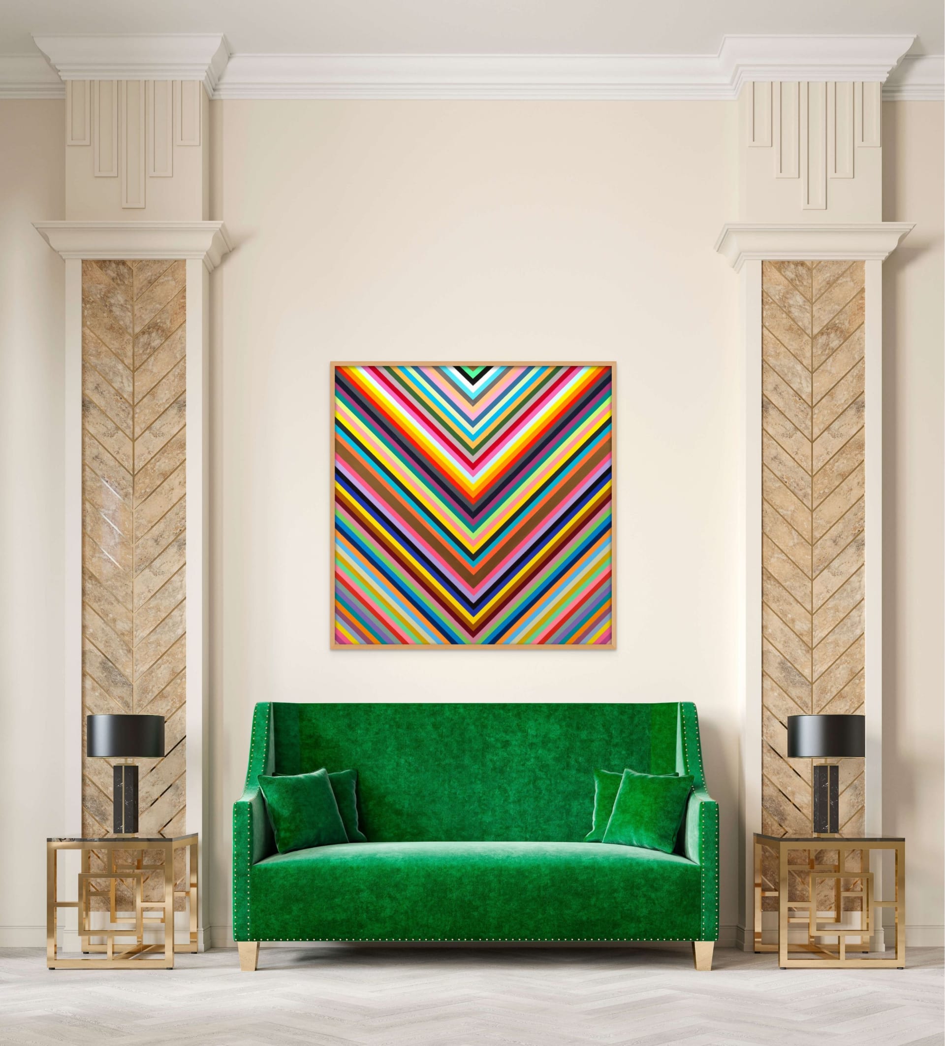
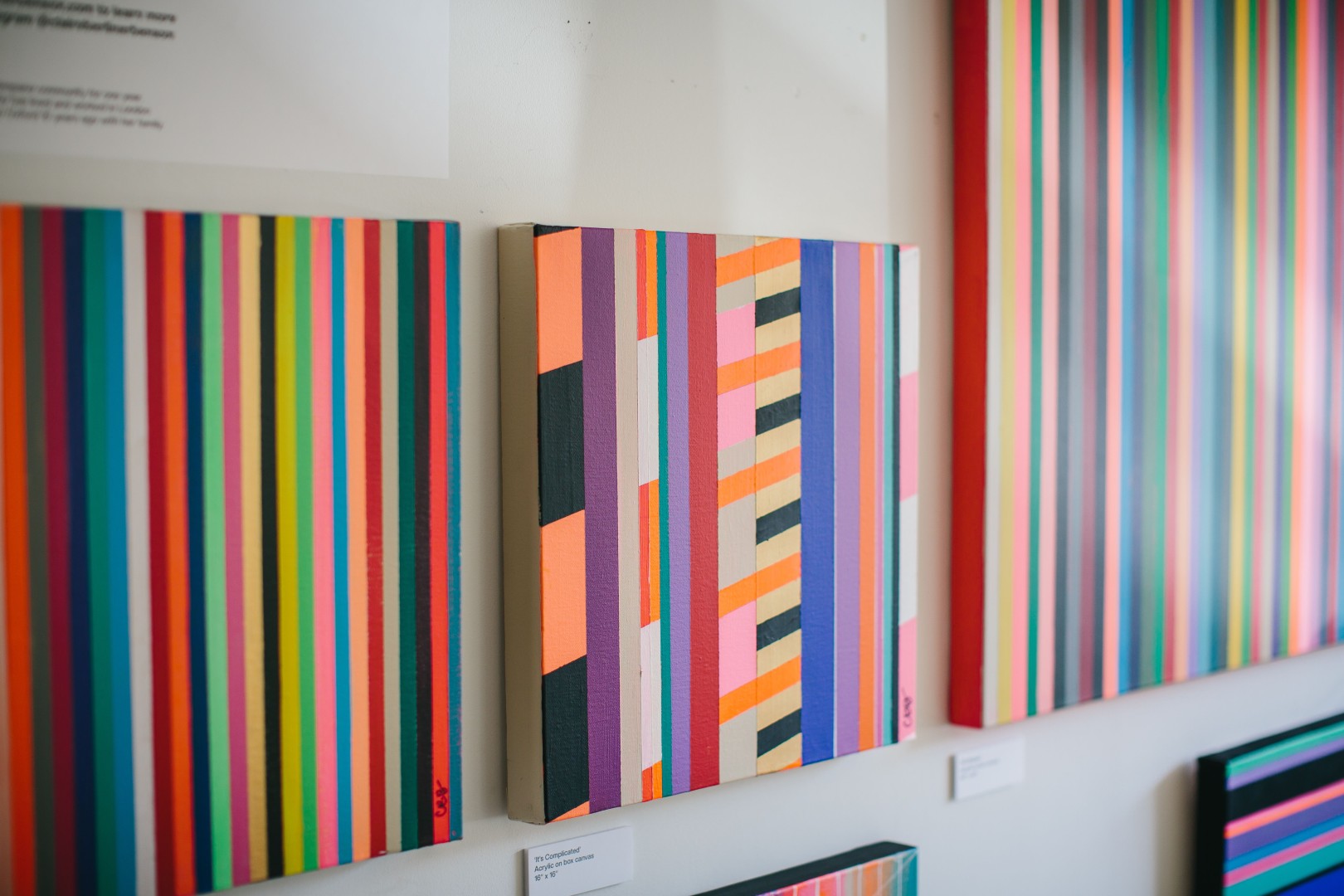
It’s bold, bright and geometric – with a lot of colourful stripes. I work with acrylics on canvas and each piece represents me at the time I painted it. My art is an expression of my thoughts and feelings; I never know how a piece will turn out until it’s finished, it’s an entirely natural and instinctive process.
From a distance, the paintings look like clean stripes, but when you look closely, you can see the hand painted imperfections, the roughness of the lines, the human touch, the texture of the canvas, and often, the colour that was painted underneath the top colour, giving the pieces a rich and layered depth.
Finding the best quality paints is crucial. I am always on the hunt for the most interesting shades. I am not brand loyal at all. Daler Rowney make the best neons, Golden make the best metallics and Culture Hustle make the bluest blue and the blackest black.
What directs you to use certain colours with or against each other?
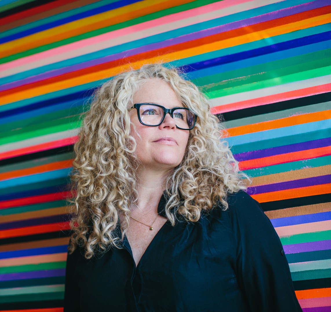
I am obsessed with colours and the emotional chemistry between them. A trio of blues can transport even the most reluctant critic to a soothing refreshing state, whereas a clash of neons can excite, ignite and empower. The combinations are endless and I’m always scanning for inspiration to bring to my paintings. I see the world in palettes and schemes, and am forever taking photos of everything from landscapes, cityscapes, markets, fashion and street art…I find new ideas everywhere.
In my larger paintings with many stripes, I work on two levels: micro and macro. The micro level is about each individual colour and it’s next-door neighbours. How is everyone getting along? Playing nicely? Friends or not? It’s not about wanting the colours to match – far from it – I lean into the awkward pairings if they induce a strong reaction. The strangest colours can be the most harmonious and generate a feeling of resolve or invite you in to question their compatibility.
On your website you challenge the reader and ask how colours make them feel and which group of colours on a painting appeals the most and why? Can we ask that question back to you?
My personal passion is for neons and bright clashing colours. I sneak my signature pink and orange neon into nearly every painting. A touch of neon makes the other colours much happier too – raises everyone’s game a bit. Does that sound a bit bonkers? Probably!
Do you work only in abstract?
I walk my dogs on Port Meadow every day. We are lucky in Oxford to have such an epic expanse of sky and land right here in the city. I am mesmerised by the ever-changing cloudscapes. I take photos and paint them but more as a meditation for myself rather than anything commercial. I take life drawing classes most weeks, and have painted portraits in the past, but I do feel abstract is the best expression for my art at the moment.
How did you come to make this your career?
I’ve been a Graphic Designer since the 90s and have worked in agencies in London and New York. My husband and I set up Berliner Benson, a creative branding agency, while we lived in Brooklyn, which he is still running today in Oxford.
I’ve always painted for pleasure. I took an Art Foundation course after school and although I was tempted to pursue Fine Art, I decided on a Graphic Design degree instead. That led to a 25-year successful career working with incredible clients on global projects so I have no regrets.
Creativity comes in many forms, and I’ve always found different expressions for mine. During lockdown in 2020, a very good friend of mine turned 50. I wanted to make something special for her, so I marked out a 100 x 100 cm canvas with 50 equal vertical stripes – one for every year of her life so far – and painted them while thinking of her, choosing colours that represented her, and our adventures over the years. The stripes were originally intended to be the background for a central motif, but when I’d finished the stripes, I just knew the painting was perfect exactly it was. The stripes alone were powerful and offered so many little stories and journeys; this cluster here of greens, this dark pair, these pastels…they took me on a journey, and it would have been wrong to push them into the background. That painting was so satisfying to make and my friend loved it too. So from that dark November in deepest lockdown, came this bright expression of joy, and I haven’t stopped making new pieces since.
Where would you like to take this?
I’ve participated in Artweeks as part of the Makespace group exhibition for the last two years which has helped to gain some local appreciation. And I’ve recently begun making museum quality Fine Art Prints of the most popular canvases which can be purchased on my website. The prints are an affordable way to bring my work into homes and businesses where buying an original canvas may not be an option.
I’ve also had several commissions via word of mouth. I love working with people to create bespoke paintings that feel personal to them. However, I often find that the pieces I create with no brief, connect strongly with a wide audience as people discover their own meaning in the work.
I am happy painting in my studio, increasing the body of work I can offer for sale, and taking commissions. I still have a lot to say and explore through my art, so I will keep doing what I am doing for now. Next year, I would like to take my work to art fairs to see what kind of response I get there. The prints I have been making are really beautiful quality and I would like to bring them to the fairs that specifically showcase prints. I also plan to develop a series of repeat patterns for textiles.
Which other artists inspire you?
I love clean bold brave graphic art. Even as a child I was drawn to Matisse’s cut outs and Warhol’s prints. Later, I discovered the joys of Josef Albers and the Bauhaus Movement. Bridget Riley, and most recently modern artists like Ellen Richman and Robert Szot to name just a few.
Where else does colour feature in your life?
I’m a maximalist as you might have guessed. I like bold bright colours. In my home, the walls may be neutral, but the art is bright and eye catching and the textiles are loud. There is a mixture of artist’s work, bold graphic prints and photographs. The more eclectic, the better. I love putting bright accents everywhere, and I adore interesting vintage things. If I was to have an alternative career I’d choose buying and selling vintage/antiques art, items and furniture. I also studied Interior Design at KLC in London which gave me a strong sense of context for pattern and colour.

