Perhaps the most obvious way to mould your home to your taste is to start at the very bare bones - paint.
We are incredibly excited to share that we are stockists of William Yeoward's Paint Gallery. Available in four finishes and 114 exceptional shades, each given extremely witty names and inspired by a favourite thing, object, or colour.
It's the meticulously considered palette that we love; rich, vibrant and full of depth. Being 100% water-based, sustainable and having exceptionally speedy re-coat times helps too!
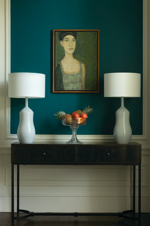
Some of our favourite shades (which may or may not be influenced by their names) are; Mushroom Risotto, a warm and inviting mid-toned grey; Sailing boat, a rich mid-blue, inspired by a sailing boat in Cornwall; Indigo Bleu, a deep and striking colour which adds drama; Jasper, inspired by the gemstone, green with a hint of blue; Wellington Boot, the deepest and richest green.
If you're looking for a way to start your journey into colour or simply update your home, follow our top tips to make picking the perfect paint palette so much easier.
Picking a colour scheme
Begin with the practicalities. The paint colours you choose for your new scheme will need to work with the existing furnishings you may have in the room. Make decisions about what will stay and what will go so you know what you are working with. At this time, also consider other ‘unchangeables’, such as the period and architectural characteristics of your home – flooring, perhaps, and the levels of light; you will want to compliment the proportions and atmosphere. If a room needs to be made less stark, use darker colours to create a cosy cocoon; to give a larger sense of space, lighten the colours; and in dull, north-facing rooms, use warm tones to brighten them up.
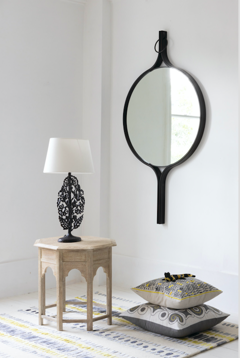
Caption: Mirrors are beautiful additions and have the added benefit of making space appear larger while reflecting natural light. They can add a warm metallic to create textural contrast with other pieces in a room.
The power of light
Recognising the natural light in your space is an essential starting point. Light has the most significant impact on how colour is perceived in your home. The volume of light your space gets, the direction of your light source, and the setting of existing colours — furniture, window treatment and rugs — can alter how colours appear. This is especially true with whites and neutrals which tend to reflect any other colours present in and around your room. Bright, clean natural light will show colour in its most accurate form, whilst softer, south-facing light, for example, tends to take on a richer tone.
Ultimately, your choices have to work with the type of light you have, both natural and artificial. Get the largest samples you can and position them in the room to test out how they work with the different levels and types of light throughout the day.
Fabric and furnishing focus
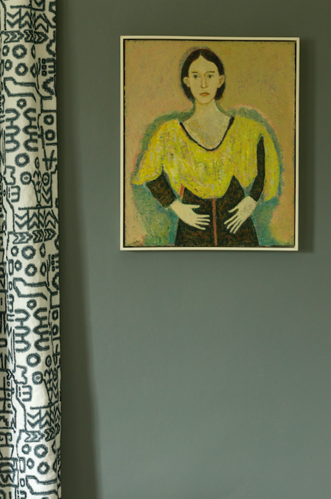
One of the most straightforward methods to select interior paint colours is to start with the fabric. I often find that it is much easier to choose a paint colour that goes with your furniture and decor than it is to choose furnishings to go with your choice of paint.
. Your soft furnishings such as curtains, upholstery and even cushions can provide you with paint colour ideas. If you're planning an accent wall, look at the boldest colours in the material. If you would like to choose a paint shade that is more subtle, or for a larger space, look at the colour in the small details of your fabric. It can be a good idea to take a fabric swatch to the paint store so you can choose appropriate colours to view at home
Perfect pairing
Pairing two paint colours together has become a sophisticated trend. In most rooms, a muted tone complemented by a vibrant colour will work. But, in smaller spaces, opt for neutral shades from the same palette for a timeless look.
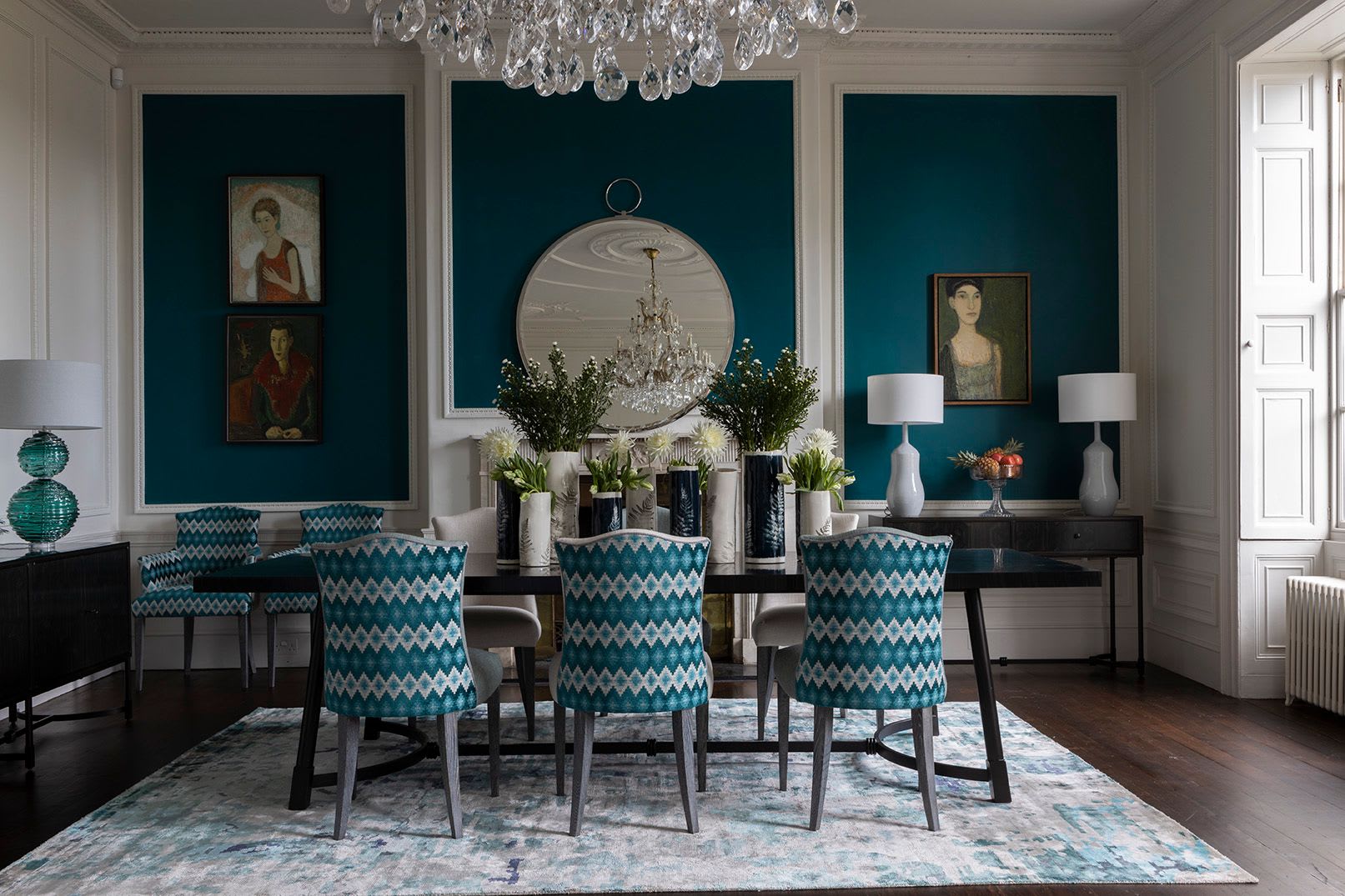
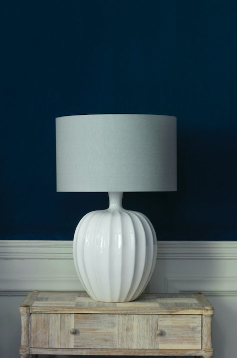
Undoubtedly, the ultimate time-worn colour partnership of blue and white has to be one of the most popular colour combinations around. As displayed in the picture above, the deep and striking shade of William Yeoward's ‘Indigo Bleu’ paired with ‘Snowglobe white’ demonstrates this colour scheme is equally as elegant when used in a home with a country-style look as a home by the sea.
Testing, Testing
Buy paint tester pots and samples; it is always a good idea to test your paint samples colours on as large an area as possible. Often, they will be brighter and lighter or darker and duller than you expect. It is also useful to see them in situ with other room elements. Any colour change can initially be uncomfortable, so live with it for a while to make an objective judgement.
Last but not least...
- Fashions come and go. For a scheme that will stand the text of time, be true to your personal tastes, follow your instincts and go with what you love.
- If you see a trend you like, dabble in it and create a mood board with samples to see how they work together.
- If you find it hard to picture colours on a larger scale or need inspiration, spend some time looking through magazines, books, the internet, interiors shops and other people’s homes.